Art/Game Design

I’d like game design help and art help, from anyone who is skilled in these fields (@Baron_Wasteland @glowbug @Greggo @Recryptech would be nice to hear from). Here are some games I’ve made (I don’t think they’re very good):

If anyone could give feedback on the art/game design, that’d be great. I’m looking for tips on how to make art look polished, even if you aren’t a great artist.

If you want to check out anything else I’ve made (like a million unfinished, huge projects), check out my profile page: Flowlab Game Creator - Sign In

4 Likes

two big things, I think would do a lot of good to fix

  1. Mixels usually look pretty jarring, I’d try to minimize those. mixels are when you have different sprites with different resolutions next to each other. it makes it seem like a crappy photoshop and the sprites don’t look like they belong in the same game. keeping a consistent style, color palette, theme across all the sprites is really important. I noticed that for Inverted Extiction, there is a lot of inconsistency in the sprites in terms of style and resolution, so I’d recommend you stick to one thing.

  2. Try to not make your sprites look too ‘naked’, which is to say try to not leave big empty spaces in the sprites. it’s not recommended you make a sprite in higher resolution unless you’re planning to use all those pixels for something. for Historically Loony, the sprites look like they’re in a way higher resolution than they need to be. you could easily remake those sprites to be 16x16 pixels. when you make a very simple sprite lower resolution with larger and chunkier pixels, it makes it look nice without seeming ‘naked’
    image
    here’s an example. since the little fellow has very few details, it makes more sense to put it at a lower resolution, so there aren’t any big stretches of homogenous pixels like you see on the sprite on the right.

Hopefully this helps, and if I didn’t explain something clearly enough, please lemme know!
(I might add more to this tomorrow but now I really need some sleep)

4 Likes

Going solely off the example games here;
I generally second what the baron has mentioned- though, besides his example, I feel that his advice is sort of blanket to all games and creators. And I also didn’t see too much of it in your games.

I will say however that the problem I have noticed is your use of maybe one or two detailed sprites that clash heavily in contrast to the generic sprites around them.
An example:

Screenshot_29

\Due to the lack of a background, your charming Dinosaur sprite is a nice visual- although unfortunately I don’t see much else by way of aesthetic and renders the good sprite as more of an issue then anything. Your games are very minimalistic, I say run with it and give all your sprites 50% effort to create a consistent theme- instead of 100% effort on 1 element and 0% to the rest creating this imbalance.

I also found Historically Loopy to be a little busy and cluttered- but that is purely a personal preference and may have been intentional. You can’t please everyone, make a product your happy with and hope for the best.

3 Likes

I’ll go a bit into game design here, not that I’m an expert but I have :

Historical Loony looks good, but you’ve got a problem with the UI, the buttons don’t look like buttons.
It’s not a problem of bad design, with a bit of time the player would probably know that you could click on it but in design, you want to try and make it as obvious as possible.

Here, the fullscreen, main menu, and “to your hall” buttons are kinda hard to see as they have no background or base to stand on, all the stuff in the background makes it messy and hard to look at.
All you need to do is move a few torches and skulls out of the way or make the buttons have a base so that they aren’t hard to see.

They don’t need to be complex, just a simple box would do to make it look like a button.
AAAAAAAAAAAAAAAAAAAAAAAAA
This next thing is more on the relationship between sound and art. When you fill up the collection there’s a beeping noise that players, it’s there to tell you, “hey! you’ve filled up your hall” but the player doesn’t know that.
You have nothing to signal what the beeping is trying to direct you to. If the “to your hall” button were to flash it would signal that there’s something in your hall. Try to make sure when you’re trying to direct the player to something, make it obvious.


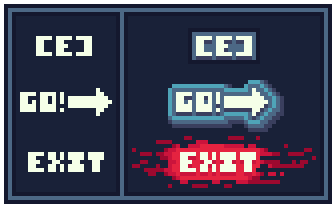
Inverted Extinction, the main menu changes color based on where your mouse is… why?
It’s not immediately noticeable but it’s harsh on the eyes when it flips this quickly for no reason.

During play, there’s a timer in the top left-hand corner, but it’s a bit hard to see.
This is just another problem of needing to make things more obvious, the timer is a key part of the game so it should be very noticeable.

Other than this, maybe make the transition a bit smoother, or an option to, the player might get a bit disorientated by the constant switching of both colors, you should also probably add a small warning for flashing lights as it is a bit startling.


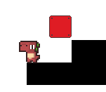
Drift, a great game, the only thing I have to say is make a way for the player to know where the enemies will spawn, right now they spawn… somewhere, right now they can just spawn on top of the player, instantly killing them which can be a bit annoying.


I think that the games are good, it’s just these small things that I wanted to point out.

3 Likes

Thank you, everyone! :slight_smile:

2 Likes