but any suggestions what to add
it looks like Rocky but Nai
“i have two sides” ahh sprites
6 Likes
bro ![]()
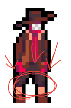
whats going on here
1 Like
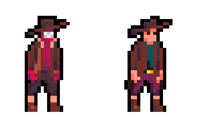
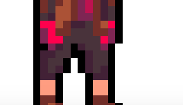
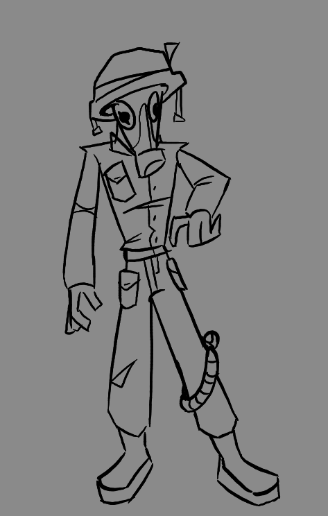
what, thats just his pants
is his skin red
1 Like
buckingham green doesnt have any skin
he was born without it
its red because thats his flesh/muscle under his skin
2 Likes
thats meant to be fur lining around his boots/cloth wraps around the bottom of his pants
1 Like
ok – thats what I thought I just wanted to make sure
1 Like
ah, alr then
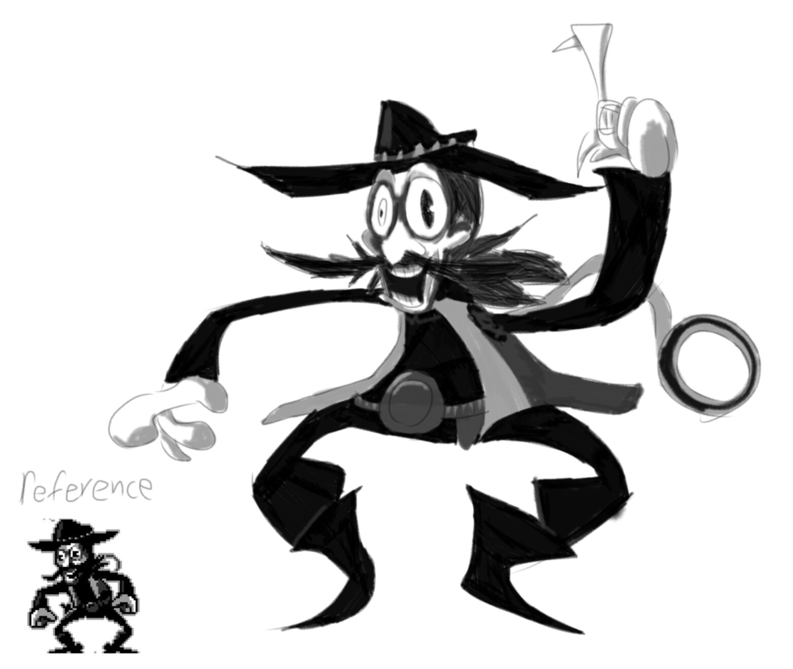
You say fast, I say “Oh ive only been learning to draw humans since i got given a pencil”
Part of it for me is i study other people and also i look at many different tutorials to like get an idea. Another part of it may just be personal style and muscle memory. This is like the 4th different body layout i’ve tried and it’s the only one that works for me. So i would say try lots of ways and then also study like actual people not drawings. Also don’t use mannequins if you don’t want stiff poses .
7 Likes
friend inside me
5 Likes
Friend inside me
4 Likes
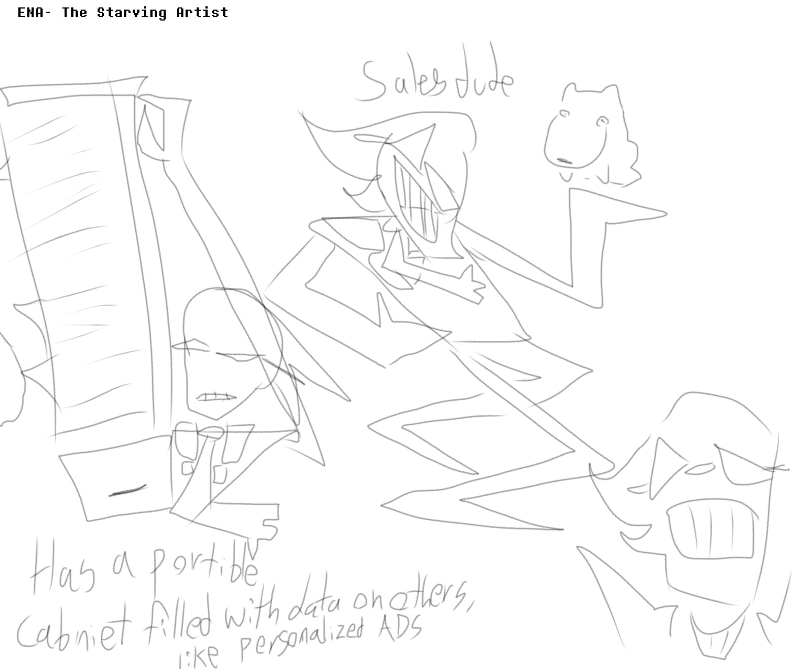
I made some more concepts for ENA: The Starving Artist!
Summary
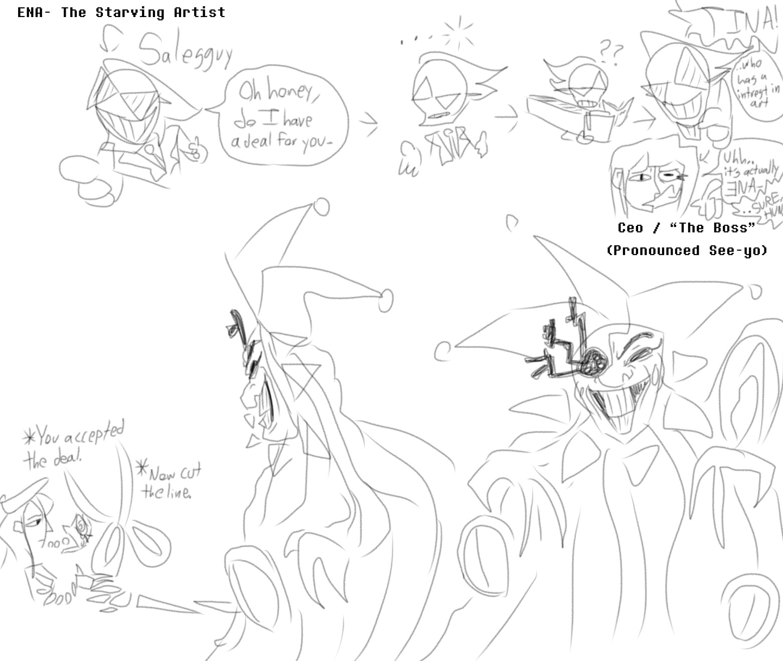
In case if I didn’t mention it before, ENA The Starving Artist is more of my interpretation of both the Ena Series and Dream BBQ, with Starving Artist taking place on the timeline in between the series and Dream BBQ.
A lot of people seem to think ENA is a species, which while it is a decent theory, I don’t agree. Personally, I think the reason why ENA looks different in Dream BBQ is because it’s the ENA from the series, just older and with a job.
Large ramble on why I think this. (Sorry if it doesn’t make sense, I’m not real good at putting thoughts into words)
What made me think that was the art style choices for them. The series usually consist of white landscapes, and pretty simplistic and geometric features. While meanwhile, Dream BBQs color palette for the landscape seems more harsh, with red being the most dominant color. Not to mention the more detailed features on both the landscape and buildings.
What also contributes to the contrast between these additions to the ENA series are how ENA herself acts very different in them. In the series she seems to act more child like and ignorant, while in Dream BBQ ENA seems to be more aware and lacks really any positive emotion. While you could argue Salesperson ENA is the “positive” side, Salesperson more seems to be a persona, aka the customer service side of ENA.
Due to that, Starving Artist takes place more around the 18-20 years old mark, where people get to experience the world on their own. I’m wanting to make Starving Artist as more of a contrast to Dream BBQ. For example, Dream BBQ feels like there’s so much to see, but at the same time constricted and limited, which connects to how ENA truly feels about her situation in Dream BBQ.
Meanwhile, I’m planning on Starving Artist to feel open to show the freedom ENA feels in that moment, but also how it can be overwhelming with the amount of choices.
So yeah, sorry for the novel
I’m thinking of making this a game on FlowLab, and making it kinda like how Power of Potluck was shown
6 Likes
I’m going to end you.
Nevermind, this is gonna be the best Flowlab game in existence ![]()
3 Likes