…but BETTER
3 Likes
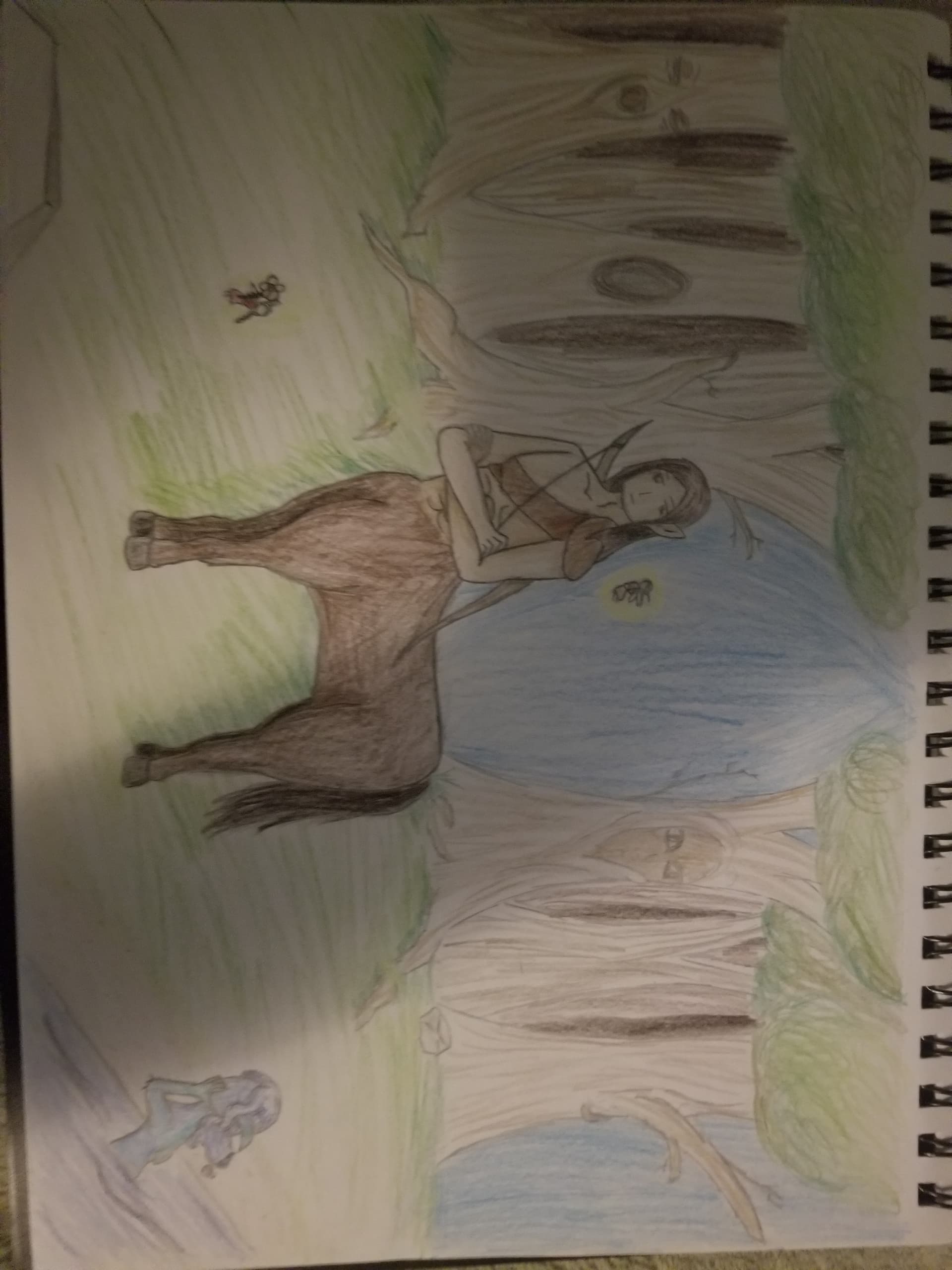
Here is my centaur for the contest. Which actually turned out pretty good in my opinion for it being the first time drawing a horse body and full background.
6 Likes
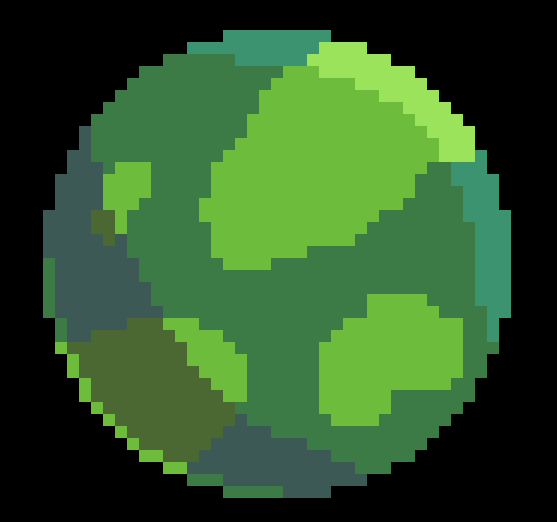
Why is there no shading on the left border of the planet? It looks off.
1 Like
Not quite sure what you mean by that, can you explain?
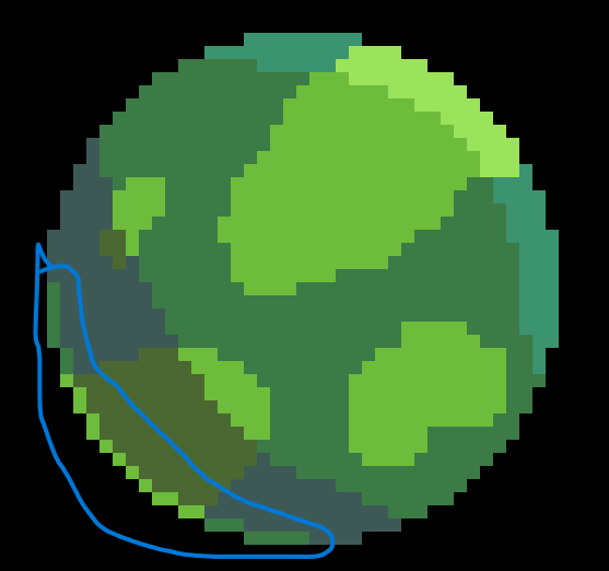
Oh, that’s the backlight.
Maybe add a bit of shading at the bottom to really make it look like a sphere. If it has life or gasses, it should have clouds too.
Oh, I see you’ve already changed the first thing, sorry for the late response.
1 Like
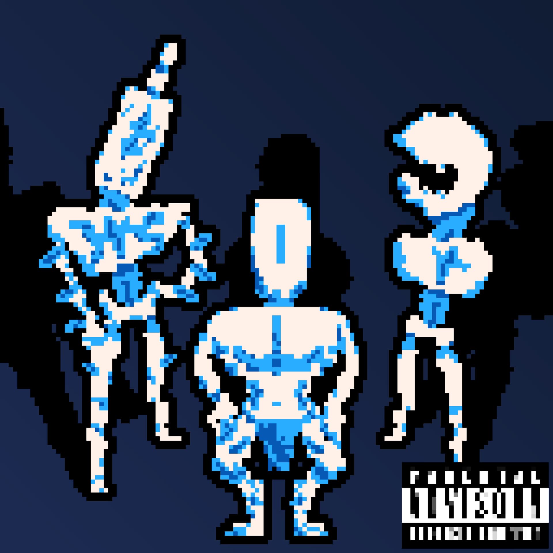
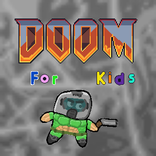
New game cover that combines photo editing, pixel art, and digital art:
1 Like
I wonder what that game would be like to play.
1 Like
The real game journalist experience
1 Like
It does have life, but basically only plant life, so greenhouse gas buildup wouldn’t happen much.
2 Likes
please maintain a consistent artstyle
this looks so wrong it’s insane
2 Likes
Thanks! It really fits the concept behind the game. The game itself is more consistent though.
1 Like
XD. I don’t think that was meant as a compliment, but one can never tell with you teenagers.
Rez is right though, there are two very distinct art styles used in this picture.
3 Likes
Pardon me? I don’t understand anything I just read.
1 Like
Ok, also, I need to work on my art submission! I have been pretty busy these past few days. Bad luck, I guess.
2 Likes
not screenshotting it because i have no clue what you just said
3 Likes
![]()
Here is a 3d minecraft skin i make from skrach
https://www.minecraftskins.com/skin/22170709/inferno/
1 Like