I don’t know much about shading but from what I know it’s kinda hard.
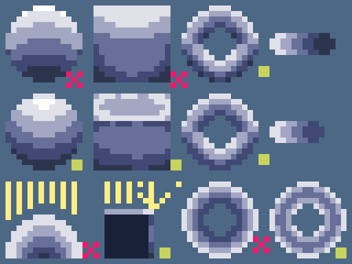
First, you need to know where the light source is, in this case, let’s say the light is above.
Just as a side note, there is no one way to shade all things, so don’t feel like you have to stick to rules or follow everything to a T, just remember that they’re an extra variable in your art.
I’ll use three basic shapes, a sphere, a cube, and a ring.
I don’t know much about how to shade a sphere but you want the light to curve around the object, in the example, the first sphere isn’t technically wrong but it doesn’t look good either, when light hits a sphere the highest point becomes lighter and gradually becomes darker, but it’s better for it to look better than to be correct.
Cubes have tops and sides, but it seems people forget edges, they become much brighter because they reflect light into our eyes since they bounce off the edge. That’s all you need to know since it’s quite important, not doing this makes the object look round and it won’t show the edge.
Rings are great examples of light reflection, the top is light while the bottom is dark, like a sphere but you have to remember that light will also hit the innards of the ring. I also want to bring up the importance of not over-shading, you want it to be much more visible so don’t use too many shades. Also if you do make it that the light source is all around the ring make sure you shade it correctly, light will hit the innards of the ring so you should only make the middle of the ring darker.

That’s all I can think about, for now, also this might not help you as much since I’m basing all of this off of pixel art so it might not apply to that kind of art.


