@hihilogic can we c it yett?
It includes you, too :3
not yet…
OOOH THE TENSION IS STARTING IN MY BRIANNN
I MEAN BRAINNNNNN
lol is that good ;-;
uh ye it means im excited lol
lol okay… whatever you say
;3
Also includes the mains like @meburningslime and @ManiacPumpkin
Weeeeee…

oooop u summoned them lol
Has it got Grazer
ikr lol i pretty much got the samee except for im spamming in other chats lool
Yes it has @grazer. He’s a little kitty peeking his head out from behind my chair. He’s also got a helmet.
wooooooooooh no need to go tag cra-z with tagging Grazer! Isnt that a watermelon helmet tho lol
Yeah… :3
hav u done it yet lol
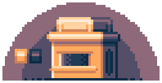
Here’s a small example of a coffee shop kinda thing.
Now that I think of it, the theme cafe was not a good way to describe what I was thinking…
Anyways, just to clarify what I meant I wanted to make an example just explaining and giving some ideas.
Also, note that this was really quickly done and if I had more time I would add a lot more details.
Pallet: the link to the pallet is here.
PX size: 64x32
Program: Asprite, Krita, MSPaint (any program is fine, these are just the ones I use)
The theme of the building was a toaster, I chose it to keep it basic, small box shape with only a few things that make it loof like a toaster, you can see the bread on top and something on the side.
Remember to shade the object relative to the light source, in this case, the light source was to the top left. You can use shadows to convey depth, I made the side that was away from the light source use a whole different color set than the front.
It’s important to keep your style consistent, I made it a bit cartoony so I didn’t use too much shading especially on the bottom of the building.
Also, there are things that I didn’t do that should be taken into account, like objects, there’s a lot of empty space, I could fill that up with a plant rock or electric box, I could have also added some grim on the top and bottom of the building to convey its age. I didn’t do these for the sake of time but you can if you’d like.

This was just my example, it’s not what your art needs to look like but it’s just here to show what another submission might look like. What I said might not apply to you, it might even make it look worse, beware of what your style is and how you can add to it or what you need to remove from it.
If you have questions on any of the stuff or if you’re still a bit confused about what I meant the just ask.
Okay, I’m going to be completely honest now, this was just an excuse for me to draw…
Good luck everyone, make sure to take your time and have fun!
This is amazing, but these edges need to be rounded…

I was gonna draw a whole cafe… can i still?