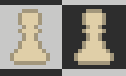
These outlines look very different on two different backgrounds. Is there a way to to negate this? what is a good way to get an outline color?
1 Like
I haven’t really played with outlines or color contrast all too much, as of late, so I did make a few samples just to see what would work.
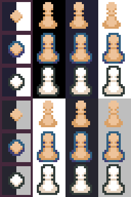
In my opinion, it’s probably best to just have the light pieces have a darker outline and the darker pieces have a lighter outline, that way the outlines stand out when they need to highlight the pieces and are hidden away when the color of the pieces already contrast the backgrounds color.
Having a desaturated board might make the pieces look better but then it really makes the atmosphere all dark and moody, if you want a more classic chess look (plain black and white) then I would say to desaturate it a bit but if you want a bit of color in the blacks and whites then I wouldn’t saturate them.
Unless you want it to look that way as a stylistic choice, I wouldn’t desaturate the board unless it’s like discord light mode.
Basically:
Dark pieces = light outline
Light pieces = dark outline
Don’t bother desaturating the board unless it’s plain black and white.
Not really sure what style you’re going for so take it with a grain of salt since doing all of this might throw off all the other colors.
I don’t know a way to efficiently negate the colors, or if one even exists, so it might be good to take a look at what other people are doing, look at other chess games and look at how they deal with the problem, getting reference from things that already exist are the easiest ways to find the answer.
5 Likes