Should I make this topic lounge to lock people out of it?
- Yes
- No
0 voters
0 voters
No I just said that cause 10-15 seemed like an appropriate gap
He could mean this as a mental age, not physical.
Or it’s one of those “sarcastic” posts that explain that he’s most likely older than him.
This
Man I’m starting to like making a cool post for people to analyze, even though the post wasn’t created with that in mind. As long as it’s not a bad post it should be fine.
I’m older though
Older but like, the other way around right?
I think it’s called like… younger or smth
Stop going off topic now please.
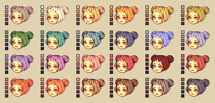
trying to make hair into alternating stripes of light and dark to make the strands is okay, but it looks pretty wack most of the time. I’d reccommend “clumping” the hair into spikes or locks of it like in this example, sort of (maybe less spiky)
Hair is often quite tough to draw right, but a good technique seems to be blocking out hair into solid shapes instead of scrambling to make every strand individually
edit: oops, PhantomWolfMoon, this wasn’t for you heh. here, @John_Shrekinson this is for u
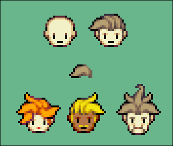
Thanks, I’ll try this! I think this is what I usually do but I tried something different. Here is an example of what some of the enemies’ hair will look like in New Taile Gamougg 4:
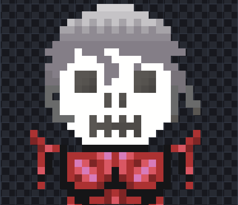
I kinda tried both with this one:
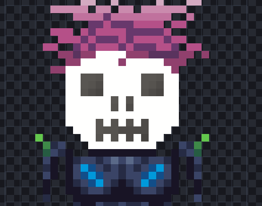
This one looks like that one character from She-Ra:
If you aren’t bothered by it, may you please give me feedback on these two guys’ hair?
i like the gradient but idk
for just the hair, I’d say you need to be more aware of the hair’s volume. hair is more than a flat 2d shape with a gradient slapped over top of it. use shading to give an object its volume. a big problem that beginners encounter is that their art looks flat, like a bad cardboard cutout. be aware of the volume, know which bits are close and which bits are farther away and use shading and shape language to communicate that.
also, general rule for pixel art: use pixel clusters! when you have pixels lingering on their own or in a skinny line, it tends to look messy and noisy. don’t worry about putting in a lot of details; it’ll only make it worse. instead try to use blobs of color, or pixel clusters, to really communicate the shape and shading of your art.
 this hair looks really messy cause you just have a bunch of orphan pixels speckled through the hair. don’t worry about the small details, make large shapes that communicate the hairstyle as a whole.
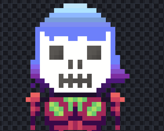
also, why do you keep using that skull face? it clashes with the rest of your sprites.
…want me to make a better looking skull face for you? same perspective and size, just…better? it’s very bland as is I think
I agree with everything he’s said
I’ve noticed the issue with your art. You always use the same shape, and that shape is just not good because the arms look kind of like tentacles (they should be connected or a pixel away from the body) and the shape is just odd in general. You need to get out of your comfort zone and begin working with different styles. Try making a 64x32 pixel character, try making a character from side view.
maybe he just likes it that way. Idk.
i know he likes it that way, so i said this
Volume and clusters, yes I should use those (thank you!).
I use it because it’s the iconic Gamougg face. Yeah sure if you’ve got time, I like seeing other people’s Gamougg faces.
Ok I’ll try one pixel away but I usually use this pose:
And then they stare into the viewer’s soul.
gotta agree with galactian, there. you should really try changing up the pose. especially for the kind of games you make, having the character stare directly into the camera on a platformer doesn’t look good. you want to communicate even just the basic stuff to the player, like where the character is actually facing. a lot of gamedev is sensory communication, with either visuals or audio (or both, both are very nice and itch people’s brains very good) so it’s good to use the character’s pose to communicate as much as you can without cluttering it.
all this to say, yes, it’s best to have your character be at a 3/4 perspective or even side view.
also unless you want to make a point of how silly it is that this character is shaped like a party weiner with little spaghetti limbs, I’d change the anatomy too.
a thing people have to learn early on with a lot of things is that sometimes being attached to an original design hurts the final product, where you stick with something that doesn’t work just because you’re fond of it. I’ve had to do it too and redo art that I was attached to because it didn’t work.
it can still be iconic, just improved upon greatly.
(My earlier offer was mostly asking if you wanted me to replace your sprite’s head, not do fanart.)
I know, I was not asking you to do fanart lol. I’m sorry if my phrasing made it sound that way.
![]()
I understand. I learned this too, but not entirely it seems.