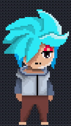
that looks SO MUCH better in my opinion! wow!!
1 Like
the smoothing out worked really nicely, good job on that (:
the shading? mm not so much imo, I’d look up shading references for pixel art specifically.
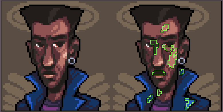
Looking at this sprite, you can see that the shading is in big blobs, instead of small uneven “flakes”? the shading isn’t for detail, it’s to create volume. if you think about your sprite as a 3d object, think about how the shading can show off the volume.
And as for the hair, I think you might want to look into how hair is actually drawn. Instead of it being a big blob with strands in it, you need to think of each lock of hair as its own individual shape. it’s pretty complicated, especially with pixel art, I’d look up a tutorial on that and also check out this reference below.
and while you’re at it try to hueshift the colors to make the whole sprite look just a bit nicer (hueshifting is when you shift the hue a little when you switch between darker and lighter colors)
yeah uh I kinda said a lot, if you want me to explain any of this better, let me know!
2 Likes
Nah, This is great thank you for more advice. I still have more to learn so I like to learn as much to become a great game developer!
2 Likes
谢谢 XIE XIE ![]()
2 Likes
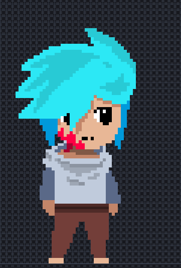
OMG Hot damn it looks to much better than this one! @Baron_Wasteland you taught your student well! I wonder whats next!
2 Likes
there’s more detail and polish, that looks nicer for sure (:
I don’t think you quite have the hang of the hair, though. did you look up references? visually analysing references is one of the best way to learn what another artist does. look up “anime hair” for example and see how that looks, doesn’t matter if it’s pixel art, but see what makes that work and how you can add that to your character.
I think one thing giving you trouble might be that your sprite is so big. it’s easy to have a sprite look super messy and cluttered for no reason when it’s that big. not saying you should make it smaller, but just a thought for in the future (I usually don’t make sprites that big myself)
3 Likes
You’re welcome!
Uh okay, but for future reference it’s actually fanart of my character Gamougg made by the very talented rcreger.
1 Like
Huh…Ok I will keep that in mind…
1 Like
Ok thank you! I will try to fix the hair a bit.
2 Likes
For the last few days I have been working on the art. So I will probably do updates on sunday, My eyes look red from watching and getting references for pixel art, I think I might sleep tomorrow and relax. Probably see the forum, too! Good luck on the jam.
2 Likes
Hi Everyone! Throughout the whole game you will be carrying a main weapon. You can not change this weapon for another weapon. But there will be a second slot where you could change your weapons. This main weapon is called The Dragon’s Blade. Here are the 4 stages!
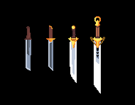
There is a 5th stage but I will save that for later on in the story…
4 Likes
That sword look great!
1 Like
Wow! Great art!!
3 Likes
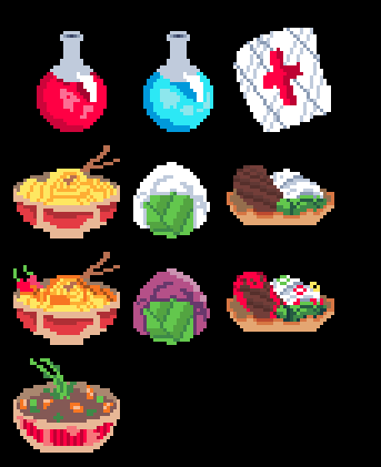
More art! I feel like this game became a cooking game! (Except the potions and bandge…)
7 Likes
Sifu @Baron_Wasteland ! What do you think?
1 Like
funnily enough, the best part of these are the noodles, which are usually one of the things that’s really difficult to make look good, so good job on that!
as for the rest, I think you could benefit from smoothing out the areas that are curved, there’s a lot of jagged edges. It’s a nice attempt to get the lighting right for the potions, but your curved areas look a little janky, try to smoothen them out.
 like so
If you want to make it really good, you can also try to do more with clusters, i.e. grouping pixels together in a way that makes sense and doesn’t result in noise.
Hope that was helpful! keep up the good work
4 Likes
Thanks! The food will be improved!
2 Likes