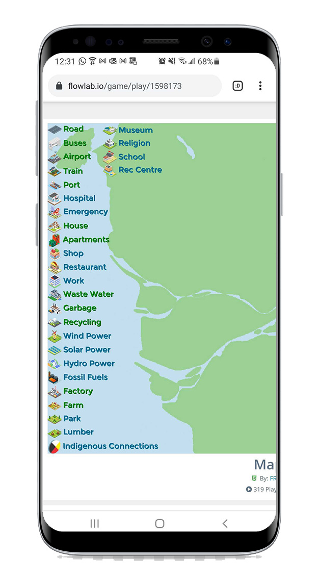
The problem I’m having now is for kids who want to play it on devices such as phones or tablets. Instead of the game scaling down to the size of the browser screen, the game is cuts off and there is no way to scroll and see the rest of the game. Here’s an example:
Is there a way to simply scale down the game without using browser zoom controls? or make it automatically register the size of the screen? (a lot of the kids playing are using different browsers and devices and they are not in the same room as I am)
If not, is there a way to create a camera that follows a click and drag motion on the background? (clicking anywhere in the map and dragging to see the rest of the map)
I realize I could make the map smaller and have a camera that follows an invisible sprite that is moved around the map using key strokes, but the problem is that if you’re using a phone or tablet you pretty much only have click and double click options.
Any suggestions are welcome, even if the solution you think of has nothing to do with how the game is displayed on the browser or dragging a camera.
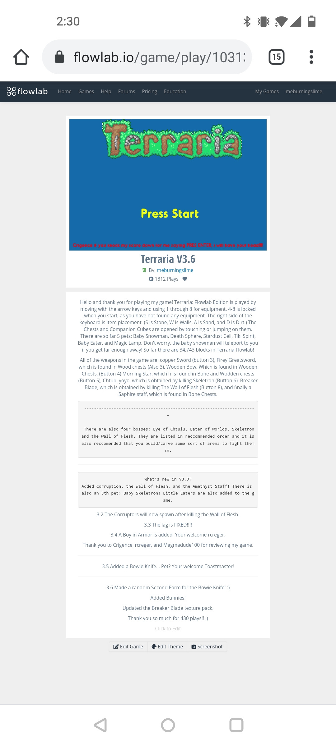
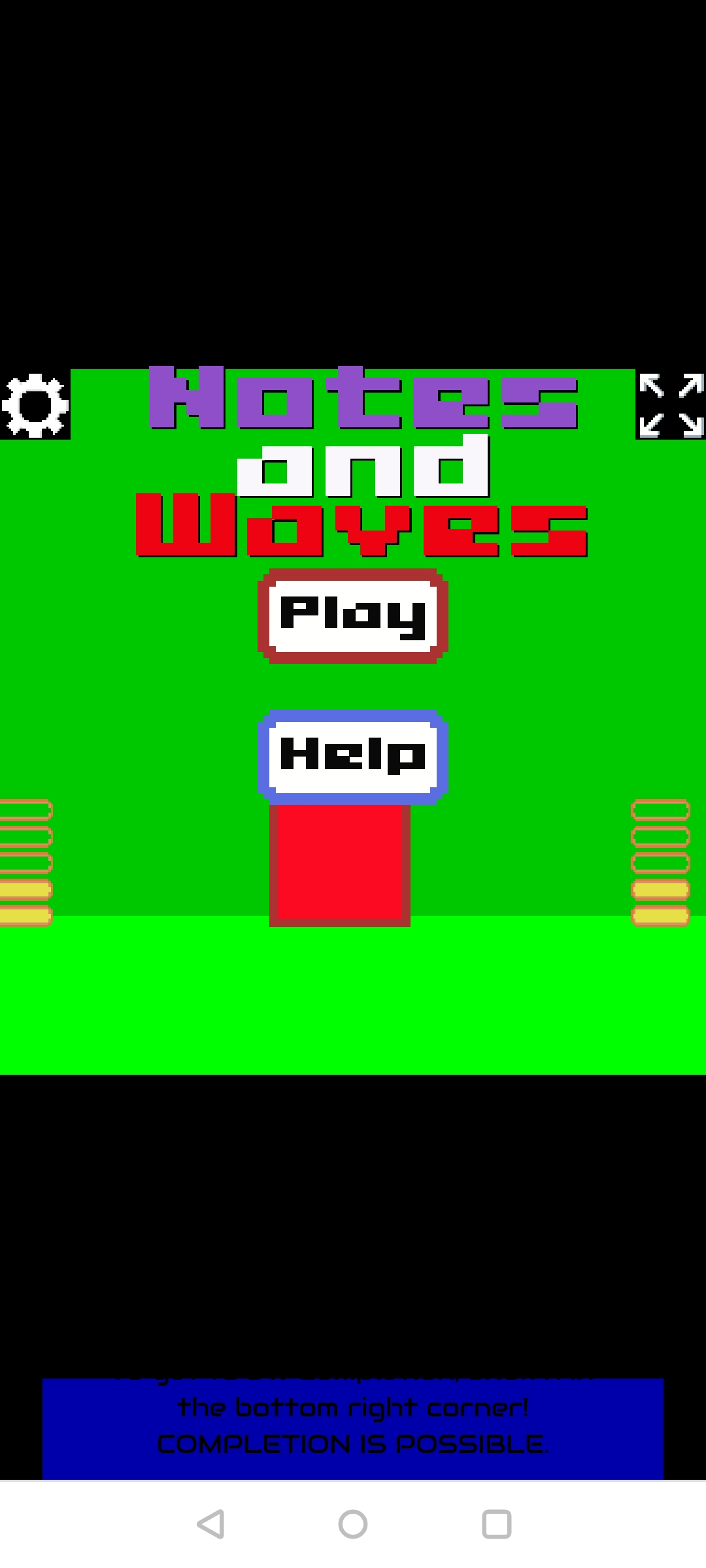
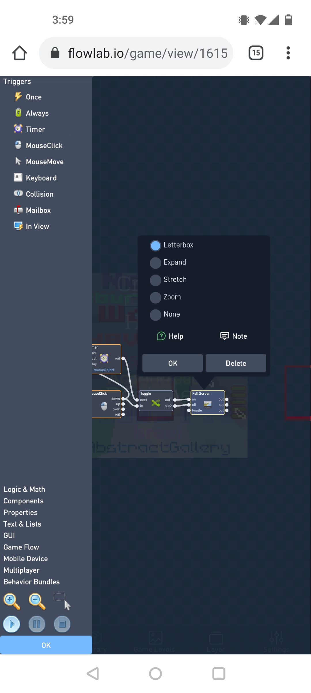
There is a fullscreen button that has several options, one of them being fit to fill. This only works however, if you have indie edition or higher. I messed around with that for a while, here’s a game I made using this feature. Feel free to take a peek at the fullscreen buttons!
The website isn’t fully set to device/mobile browser sets, the best way around this is to going into the browser settings on the phone (tap the ⋮ on top right of chrome) and click the “Desktop Site” option.
What you can also do is to download the game as an .apk (click export in “my games”) and run the file on a android device (and it will become an app).