So I am redoing my menu and need your input on which button fits the theme best.
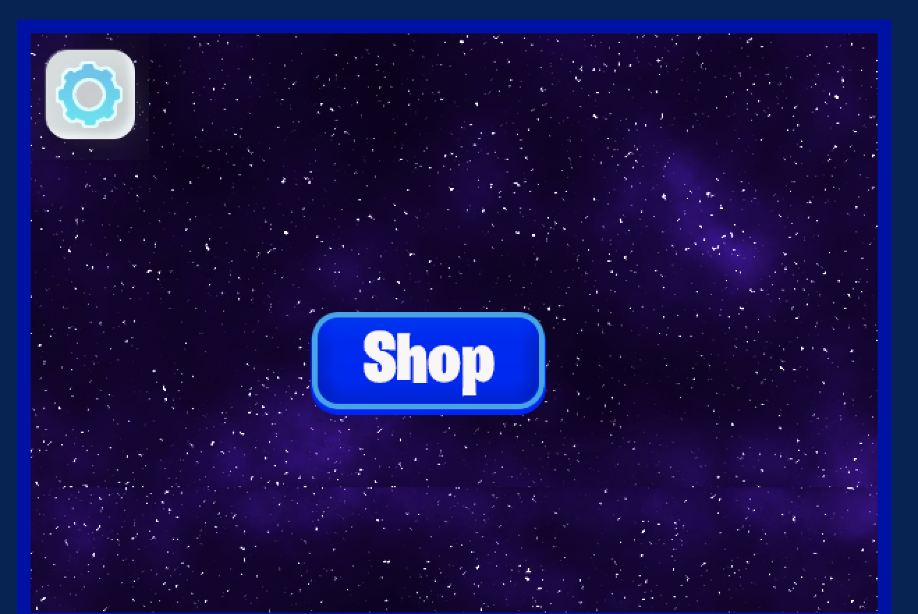

The first one in my opinion doesn’t look as good. The other ones look good but they don’t match the theme.
So I am redoing my menu and need your input on which button fits the theme best.
The first one in my opinion doesn’t look as good. The other ones look good but they don’t match the theme.
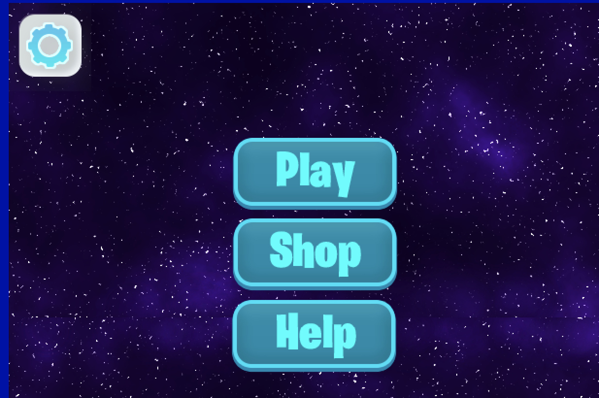
I actually like the first one. It goes really well with the border to add a good sense of theme. Maybe make the color of the word like a light blue though rather than white.
Looks good! Can’t wait to see what else you have in mind!
That looks awesome! Nice!
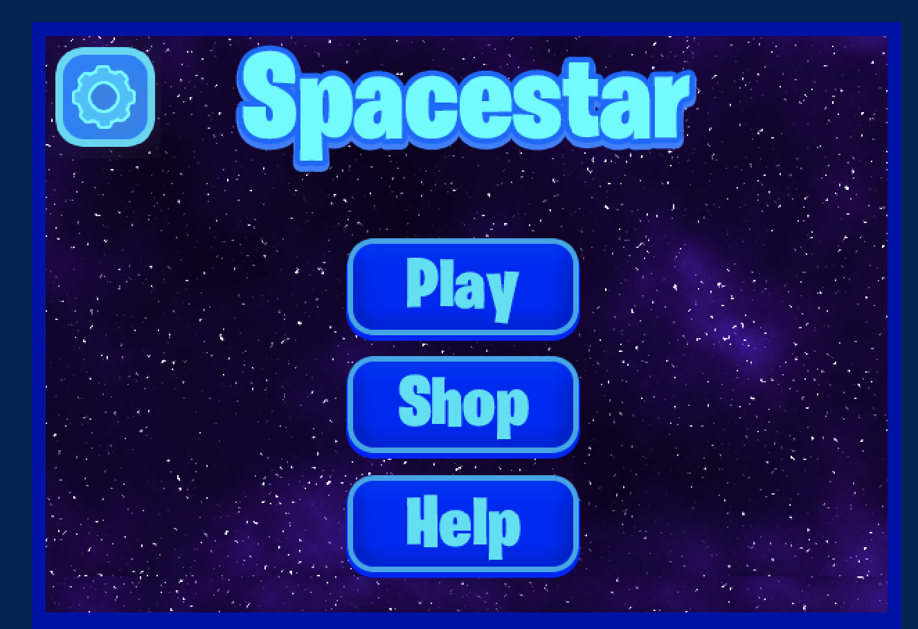
Ok I need some more input. I have almost finished the menu but I don’t know if it goes well with the game. Here is the menu:
( Btw the game is not for sure going to be called Spacestar, it’s just a test) Here is the game: (I’m also going to be changing the player to a rocket ship)I feel like it needs more green, being as green seems to be your secondary color for the game. Maybe outline the buttons in green? I’m not quite sure how good that would look but my point is that I think some green would help.