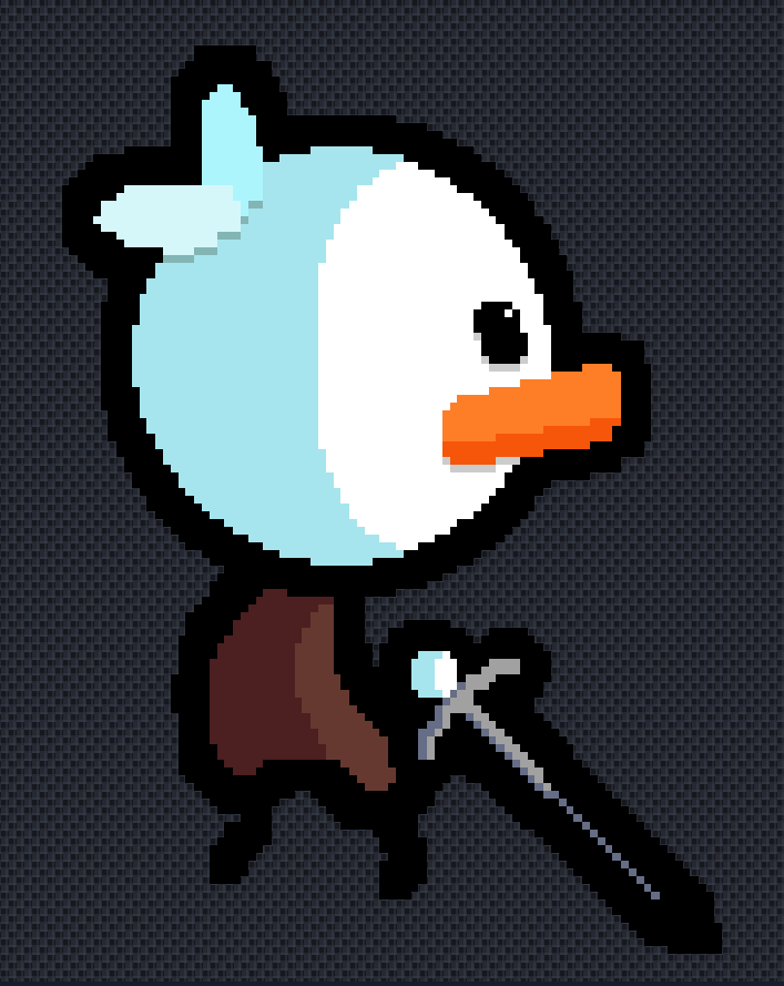
Simply I need my pixel art rated please and if you have anything that can help me improve I will appreciate it A LOT
Image 1
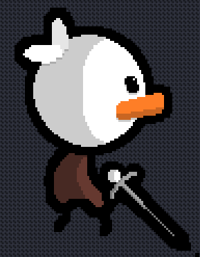
Image 2
Simply I need my pixel art rated please and if you have anything that can help me improve I will appreciate it A LOT
Yes but you can also ask @Baron_Wasteland for expert advice (I’m not really too good at explaining why this is)
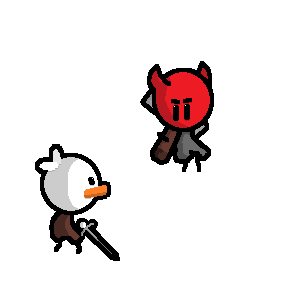
is this a pokemon style turnbased combat i am seeing here?
No lol just a sprite sheet thing for my game Ducky ![]()
Im just saying with the way they are positioned it looks like a pokemon style fight
Yeah I can see it now lol
Shading looks consistent with 2 shades per object (head, clothes, etc)
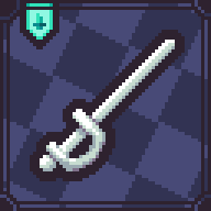
I would make the gray on the sword a little thicker so the end was single pixels for so long
I used the simple shading techniques that I see animators on youtube using. Yeah The sword does look a little funky but I haven’t figured out what type of sword Ducky should be wielding
This is the type of sword I was trying to have him using

you definitely have shapes and structure down, which not many do. congrats on that ![]()
I think you would benefit most from learning how to make your stuff more vibrant with color shifting - there are plenty of tutorials, but essentially you adjust the hue along with the brightness and it makes colors look less dull and more vibrant/interesting. I did it to one of your sprites:
Thank you for the tips I will make sure to check it out. Also I am color blind so coloring something has always been hard for me so I tried my best with these (=
ohh, i didn’t realize you were colorblind. Maybe you can ask someone to color your sprites for you then, I think that’d help. best of luck!
It looks great, although the style is a bit inconsistent.
Specifically the sword, all the other parts are thick and are emphasized by the large outline.
But the sword is much skinnier than everything else, which doesn’t really help when it comes to the outline you have on it.
Something like this might work a bit better with the style you have.
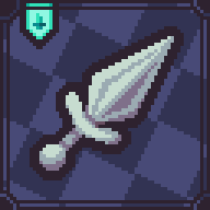
I know you’re trying to make it a much skinnier sword, but if you try to do it like it is now that part of the sprite will look strange. If you’re willing to do some compromising then you can do something like this.
Overall, you’ve got a really nice style that can really emphasize stuff but you haven’t realized how to make full use of it.
Remember, you shouldn’t be using small shapes at all, your style relies on larger shapes so make sure you’re using a large brush size.
For example, the little eye shine looks good but the detail is too small.
Also, a small note on shading, make sure you distribute the light properly, or else you might make the light look too weak. Looking at the head the shadow needs to be pushed back a bit.
had to fish this example out of the recycle bin
Oh, and this is a mistake I made while making this, if you look at the border for the first two examples it’s only 1 pixel thick, which makes it look too thin compared to other things.
I think it looks very good for the style youre going for! Its a good simple doodled style, I dont think theres antything wrong with it. You dont need to pay as close attentjon to individual pixel placement as other kinds of pixel art cause its more high resolution, so its chill. If you dont want to make it look like a cute doodle style flash game, then youd have to change some things, but nah youre good!
yes it does look good