in my opinion, the eyes look like they’re sized a bit too different from each other, and I find it kind of odd to shade the pupil hearts like they have depth. I would also avoid the pillow shading, in the light pink part of the eye.
with that said, I still can’t draw this kind of art style at all, so kudos to you!
eehhhhhhhhhh when I share galacdrive art on discord servers, people point out how flat the ships look. and they’re right. I’m pretty good at small sprites, but my work starts to fall apart when larger sprites need to be made lmao
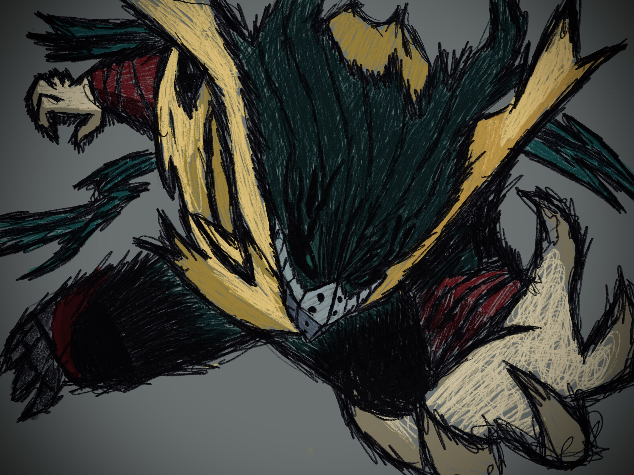
I think his head is a bit wide And you should accentuate his burn mark. If you look at Todoroki from this 3/4 view he’s cheek should be poking out it makes him look younger. And keep in mind that the further you bring the chin down older your character looks. But nice drawing I like your line quality good job .