When did this look get removed and why? It looks nice.
When did this look get removed and why? It looks nice.
if you move those around it would not look as nice.
also think about it this way
look at the pringles old logo
look at the new one
people are making things more simplistic and i think that it was a bad idea for pringles but a good for flowlab
i literally just explained why it was probably changed (and never said it was bad)
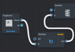
Designs change over time, that is a very old display Flowlab had when starting out.
That design was far from symmetrical, and looked weird in sets of large code.
As well change happens to make it easier to interact with and more appealing to look at.
I say it’s more simplistic (or “professional”) now with the current design.
The current style also can more easily be stylized, so we have more themes to change how they look in the main editor settings.