When it comes to visual art I’m very much an novice. Here are some questions, feel free to include any advice you think would help me or anyone else improve!
What resolution of pixels do you use and does it vary from project to project?
How do you add details? I know, not very specific, but I mean like:
Do you add shading to emphasize that there is a difference in the shape of something?
Do you use darker, lighter, or both to show change in shapes
There are probably tons of other ways to do details
How do you choose a color pallet? Do more monotone or brighter colors usually work better?
How do you add depth to a scene?
How do you go about designing a character?
Do you prefer creating more realistic or stylish art? If stylish, how do you keep it so that it is recognizable and how do you keep it consistent with player interactions / collisions?
When are outlines a good idea to use?
How much shading do you use in general?
How do you design UI to blend well with the rest of the game?
What do you usually animate? When is adding another moving object too much?
How do you add emphasis to an object to show that it’s important, as opposed to something just for decoration?
I’m not the best at pixel art, this question is probably better answered by @glowbug or @Baron_Wasteland, but here’s what I do:
I’ve recently been working at 16x16 upscaled by 2 to match flowlab’s 32x32. It gives enough room to be detailed, but not so much you’re overwhelmed
I usually start with the base object I want, and once I have the shape down I add the details and shading. Shading and lighting are both pretty fundamental and I use both. Details just comes down to you’re own creativity. Should this character have a feather in their hat or macaroni? It’s up to you
I’m terrible about this and always just choose colors I think “look good.” Usually the end product is worsened because there is no cohesiveness in the color choice. There are tons of free pallets out there to chose from, so it’s best to chose the one you think will match the product’s theme the best
This one’s a little vague, but if you want a scene to feel alive, you’ll need to add touches in the background and things that move. Make it feel alive. Maybe consider the backstory of the scene and how that may impact what it should look like or include
Beats me lol! Come up with something you think is cool and serves its purpose and keep iterating on it until it looks like a good and fleshed out character
Depeneds on the game. Usually art style will always beat out realism as art direction is fundamental to if a game looks good or not. Try making something you want to make in a certain style, if it doesn’t look good try again. Keep going until you like it. Then take that item and compare it to news ones you make. Do they feel like they could be in the same room? On the same table?
Pretty much always imo. If you’re not using black outlines for more stylized work, taking the color you’re highlighting and making it darker as the highlight is almost always a good way to make your objects and art pop. This isn’t a rule though, since you’re style can change a lot of things and the outline is just one of them. Some people make no outlines look great, and having no outlines is a goodway to give a more natural feel to your art
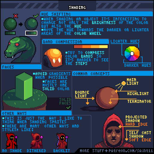
Don’t overdo it, figure out where your light is coming from, and work from there. Figure out where the light isn’t and where it is
Trial and effort really for me. You should have a general idea of what the style should be, more natural, or sci-fi, lighter in tone or darker. Don’t overdo UI either, the function should always outwiegh the form in this case. Don’t underdo it though, or it’ll look odd and incomplete/boring
Depends on what you’re animating really. Players and enemies could have a lot of parts, but the more you add, the harder it is to animate. Things that don’t move or can’t be interacted with can more easily be animated since there are less animations you can have more parts. For sure animate pretty much any movement occuring in critical objects like players and enemies, but almost all movement should be animated at least a little
I like to desaturate and darken background objects, and completely blackout forground ones. If there is something you need to interact with in the gameworld and you want to distinguish it from an average object, things like making it have an outline or blink are good ways to make it stand out
My art style tends to be unique from what i’ve seen on flow lab, I start by making a basic shape with a color, then using a darker version of that color to outline, or give emphasis. Then I shade it by making slightly darker colors.
But the most important thing i’ve found is finding aspects of the art you like. For me I found a distinct eye formation, and i’ve used only that ever since. if there’s a certain head, hair, mouth… etc shape you like, Keep using it.
I make a rough shape, fill in some colors, add details, then add shading. Recryotech’s way is the one you want to use probably, it’s the most laid out plan to help you probably. As well as plenty of amazing youtube videos
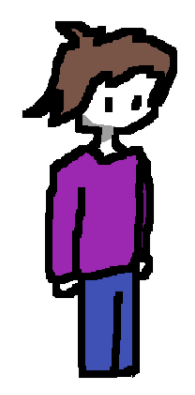
Im not very good at 32x32 and whatnot, but i usually start with the head, make the body, legs, left arm a little forward from the body, then right arm a little back. not “pixel” art, but here’s a ref:
*edit i swapped the arms around in my little description, whoopsies
I don’ t consider myself much of a pixel artist, but I can answer a lot of these anyway
Many artists work in different resolutions and styles across different projects, but the key thing to remember is to keep the same pixel resolution and grid across a project. Mixing resolutions or grids makes your art look sloppy an disjointed. Basically: pick a size, stick to it it, and stay on that grid.
There are lots of different processes, but we have examples from really talented artists we can look at, like Pedro Medeiros:
This depends on your game or project. The color palette has a huge impact in the “feel” of your game. If you want to evoke a more cheerful feeling, you may want to use more saturated hues. If you’re trying to evoke a feeling of dread, you should consider colors with less saturation and darker overall values.
Creating color palettes that work together is a skill in itself, with a lot of depth and complexity. I recommend starting out by choosing an existing palette that has already been carefully calibrated to work together, and then sticking to that same palette throughout the game. This will help the game’s art feel cohesive.
Flowlab’s sprite editor includes a bunch of great palettes of various sizes, and you can also check out the palettes at Lospec, which are great because they include examples:
Even if you use existing palettes, it’s a good idea to understand why the selected colors were chosen, and where to use them. I recommend reading these:
Color is a great way to do this. Specifically, keep in mind that cool colors (blues) tend to “recede” into the background, and warmer colors (more orange or red) will tend to pop forward towards the viewer. You can use these cues to help the background fade away and the foreground to appear closer. Another visual cue is contrast - more distant objects have less contrast in the real world, so reducing the contrast of your bg objects can also help.
I think these are all stylistic choices
I’ll let Pedro answer this one again, (and Derek Yu’s tutorial above also discusses it):
This is also a great job for contrast. Both hue contrast (think a yellow button in a blue level) and value contrast (think a bright button in a dark level) help with this. For a super-obvious example of this, take a look at Mirror’s edge (Uncharted did the same thing, but a lot more subtly):
Here’s a video timestamp discussing color to communicate function, I recommend watching the whole thing though:
Better answered by me? I mean, while yes I’ve studied most of the basic theories in art it isn’t all that useful until you have a good foothold of your art style.
If you still are kinda lost in “what your style is” don’t worry, I still am too.
I’ve been doing pixel art for almost a year now, including all the months I’ve spent doing nothing, but I still haven’t gotten a good consistency with my art yet.
Before I get to your questions I just want to say, find an art style or artist you like, then take reference from it. Not to say that you’re copying them, they have their strengths and you have yours so it’ll always be a bit different, your art style is based on what you like so always include outside sources of ideas when practicing with your style, it’ll evolve and change over time until it becomes “your style”.
It depends, yes it varies from project to project, but a large factor is also art style.
In some cases of low res art, you don’t draw eyes on the character because there aren’t enough pixels.
Grazer said it pretty well, this is a more practical thing, just keep drawing and you’ll find a resolution you are comfortable with.
There are different types of “detail”, one is about what is there, just as Recryptech said, “Should this character have a feather in their hat or macaroni”
The other is about facts.
Try to think of “detail” as more about the thing you’re making, each detail is a fact.
If the source of light is coming from above an object then make the top lighter and the bottom darker.
That’s +2 to detail because 1) you made the top lighter and 2) you made the bottom darker, these are two facts that follow the rules of light.
Of course, light isn’t the only aspect, is the object flat or round? Is the object hard or soft? Is the object flexible or stiff?
These are things that you need to study in order to know, it’s more on the theory side of art, learn it in theory then put it to the test, if it doesn’t work then go back and review then make changes until you think you’ve each detail you want.
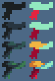
Here’s an example, lets’s list some facts:
Scarf #1
There are two main parts, the body, and the end that’s sticking out the end. (+2)
Scarf #2
The main body of the scarf is on top of the end that’s sticking out. (+1)
Scarf #3
The main body is composed of two parts that overlap each other. (+2)
*Quick note, the same could be done in scarf 2, it’s not because there are more colors but rather the use of it adds another fact, that they are overlapping.
Scarf #4
The use of a lighter color to pillow shade makes the scarf look puffy, giving it more depth and roundness. (+3)
End result: +8
Also, while detail in games can be great it can also ruin a game.
Let’s take a look at Owlboy, god is this game absolutely stunning, from art to animation it’s all beautiful, the character and world feel alive, I hate it.
Good art does not equal good design, in Owlboy the art is amazing, yes, but it’s extremely busy, knowing when to make things detailed and when to not is extremely important, not only in the scene but also in an object. Here there are no more than 4 shades of any single color, there aren’t many complex shapes, just a few bumps on a blob and a bit of shading has created a tree, remember, detail isn’t always good.
If your talking about creating a color pallet then that’s a completely different thing than choosing, you’ll need to learn about color theory if you want to do that.
Creating a color palette is a very useful skill, but it’s a bit tricky, you need to know how to manipulate brightness, contrast, saturation, and hues, aka color curves. It’s a whole entire different topic that would take way too much time to explain.
To answer the second part, it depends on the project, horror games usually use darker desaturated colors, an episode of my little pony usually uses lighter and more vibrant colors.
There is no “better” color palette, it all depends on what you’re making.
This topic actually goes into a whole different category of “complex” since it’s not only talking about art but also design which is a whole different study and practice.
The same way you would with an object, lighting, perspective, color, and less detail.
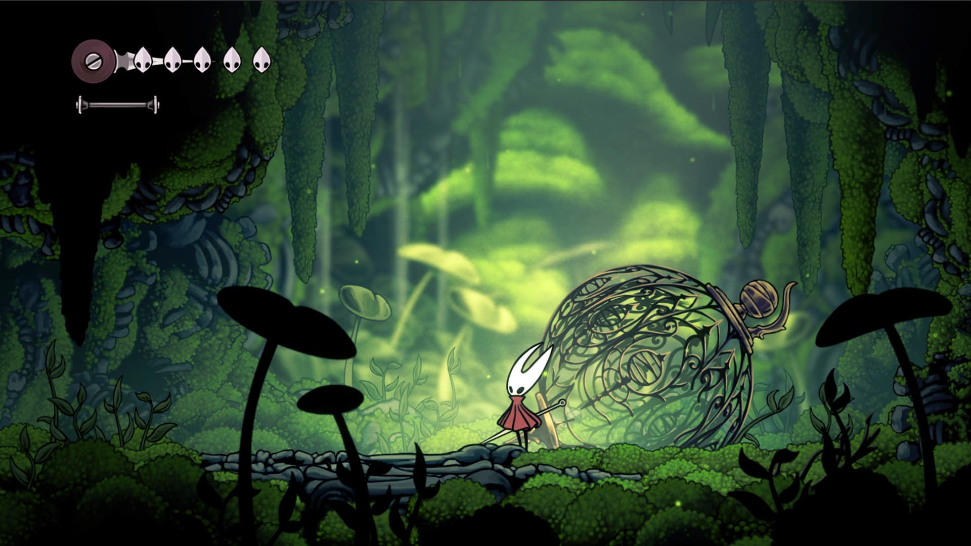
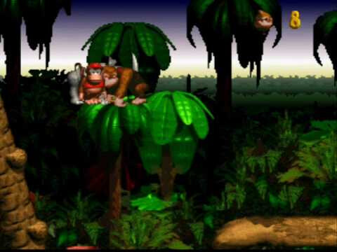
Let’s take a look at the long-awaited sequel, Silksong.
This screenshot shows a lot of basic principles, if you’re inside objects that are closer to you are darker, objects farther away are paler, less vibrant, and a tad bit lighter.
(not talking about the space that’s filled with light, it’s bright because there’s light)
In Silksong we see that the background is lighter, but let’s take a look at a different example.
In Donkey Kong Country we see that the background actually becomes darker, the tops of the canopy are highlighted because there’s a more drastic change so it’s there to keep it from looking like one big mess.
It all depends on the scenery, the location, and how you want it to feel, of course, the design also is part of this so I’ll try to focus less on that and more on art.
Just try to work in layers, you have the background, middle ground, and foreground.
Keep the middle ground clear so that people can see what you’re trying to show them.
The foreground is closer to the camera and should be kept to a minimum so that it doesn’t block anything in the middle ground.
Backgrounds should be out of the focus, allowing the focus to be put on the middle ground.
I’m not sure what you asking, designing a character is completely different from creating and drawing a character.
The former is much more complex, it involves story, world elements, logic, and tons of thinking to be put in it, it’s a completely different thing. It’s in this blurry area of a ven diagram of storytelling, design, and art.
The former is much easier to answer, find things you like in other characters or things and mash them together. Just start with an idea and keep drawing, the first draft will almost never be good, try different iterations of the same thing, change things you don’t like until you like them.
That’s really all there’s to it. How to make a character look good is based on what the character looks like, there’s no blanket statement I can just throw out there that’ll be able to say what looks good or what doesn’t.
Not sure what you mean by realistic or stylish art.
Realistic art, for example, art that looks like a thing in the real world is a style of art.
Don’t know what “stylish art” is, there are hundreds if not thousands of art styles so I’ve got no answers here.
As to the other part, recognisability is based on how consistent you are with your style of art.
You’ll need to clarify the interactions/collisions part, I don’t know what you’re talking about.
Use it whenever you need to highlight something, in game design you should highlight things by outlining them if they blend into the background and if they’re important, for example, in a bullet ■■■■ game it’s easy for the player to get lost amounts all the noise on the screen, outlines are good for things like the player, the enemy, the bullets, items, and anything that can be interacted with. Only outline important things if they get lost in the background too easily, it also depends on your art style too, there are a lot of factors that come into this, mainly because this process is in the area of game design and less about art.
Once again, this mainly all comes down to your art style, less important objects may have little to no shading at all, but really that only applies if you have a style where you do shade.
Shading does not equal good art, shading only applies when it’s a part of your art style.
You can ask how to make better-looking UI in terms of art but other than that, UI doesn’t fall into the category of “art”, good art doesn’t equal good UI, vice versa.
That falls into game design, really just design in general, if you’re interested in learning more about game design check out Design Doc, they have a whole series on it.
… When something moves?
… When it becomes distracting? Well, that or when you get on the level of Owlboy, which let’s face it, ain’t gonna be anytime soon for me or you.
The video grazer posted does a pretty good job at explaining it so I would just recommend going with that.
If you really just want to “get better at pixel art” I would just say practice, it’ll take time, use reference because it really does help helps, and ask for advice when you are stuck on an art piece.
I’m not the best person to teach anyone about this but I can give some advice based on my own experiences so hopefully, it’ll be useful to you.
hi hi hi sorry I saw this late but I’ll try to answer your questions, although I’m guessing others might have answered most of them already. I’ll just add my 2 cents on it all
for game sprites (I assume that’s your main focus) I go usually 32x32 but you can do 16x16, although I find 16x16 to restrict you too much and you’ll be able to squeeze in more details with a larger canvas IMO. when I do illustrations, however, my average canvas size is around 150x100px, but that’s a bit more detailed.
if you’re going for more detail, a smaller canvas probably isn’t going to help much. this is where the creativity part comes in for pixel art, cause you’ll have to try to make something look like what you want while removing 80% of the detail it’d have if it wasn’t pixel art. try to simplify the shapes of the details you want in low rez pixel form. you can change it depending on what it looks like in practice (don’t forget to zoom out to see from a bit of a distance)
palette depends on what you want the aesthetic to be. I tend to have a hard time getting a palette together, but I recommend looking on lospec, they have a ton of community-created ones there.
different layers usually works. foreground, midground, background, all that stuff. the farther things are in the background, the more you’d want to fade them out, to appear more in the distance. you also want to keep the eye focused on the layer that counts, so try to make that layer appear more detailed or vivid.
design can be tricky, but I go through pages and pages of random messy doodles until I can pin down a design that I’m pleased with. that’s the best way for me, to just continuously brainstorm.
I personally go stylistic all the way. you’re going to have a hard time going realistic on something on a 32x32 canvas anyway.
outlines can be very helpful to accentuate the shape of a sprite and should be considered if you think your sprite looks too “naked”, so to speak. Or just add an outline and see if it looks better to you, pretty simple.
like many things, it often depends on how detailed you feel like being. one layer of shading can be perfectly fine, and other times I’m not happy unless I’ve used at least 3. A little shading around some areas really does make the shapes pop and give the object depth, so I recommend using at least a little.
You’d want to keep a consisten style and theme, but make sure the icons stand out on their own. a good way to do this is with color contrast, so make sure the icons don’t blend into everything else or you’re going to have a hard time finding them.
for game sprites, I usually only animate the things the character can interact with (and the character itself) such as enemies, checkpoints, chests, doors, etc. motion attracts attention so don’t animate something you don’t want the players to focus on too much.
contrast is a good one, make it brighter than the other objects around. or maybe you can put a bright outline around it when the player is close to indicate the possibility of interacting with it.
I hope I could shed some insight and was helpful! I mainly recommend you just keep practicing and practicing and you’ll get better for sure (:
It’s also a good idea to look at tutorials, as I’m sure everyone else has told you. get learnt, kid!
and if you need any advice on art or feedback on some work you made, feel completely free to ping me and I’ll put on my critical eye glasses and come running over!

")