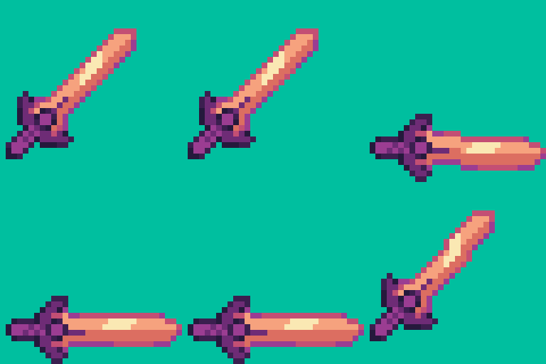
You can’t get pixels at all the angles
oh
not unless you are using very small pixels lol
I could’ve but it’s so hard to rotate things in pixilart.com
I understand the pain. I’m shit at rotating stuff 
Yeah, I need to get advice from @Baron_Wasteland on rotating pixels because I struggle with it clearly.
are all bad words banned? if so put that in spoiler : /
It’s highly requested that all non-banned swearing is at least censored, but he’s technically allowed to.
o’ great holy one of wisdom, I summon thee, answer thy pleas and bestow thou grand knowledge, acknowledge thou and reveal the truth, answer thy question and tell thou, how 2 draw???
So I’ve been trying to make this glass jar, although it seems to be a little off.
Especially the rim and insides, I don’t know how to make light go through the object.
I think the main problem I’m having is that I don’t know how to make it look like it’s made of glass.
I would prefer to not just lower the transparency of the jar if possible.


Also, if you don’t mind answering, I want to make higher scale pixel art, I usually stick to 16x16 32x32 64x64, and sometimes 320x160 but I want to move towards a higher scale. Do you have any tips on it or how I should start because every time I try I keep making it really small and revert back.
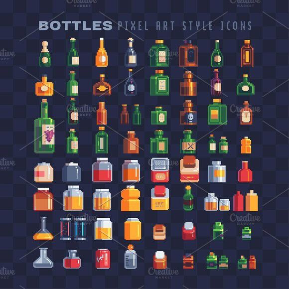
Now, I’m no expert, but from what I can tell, the thickness of the glass seems just a tad too much. Also, since there is glass all around the jar, covering even the things within in, we want to make that apparent. Shifting the colors to be a little bit cooler - or greyer - could help since it’d be closer to the jar color. Here is some examples I found online:
One issue I think also stands out is there is a little too much going on to convey the outer parts of the base of the jar. In the example, a simple thin line can go a long way, along with the shading. About 30-40% of the base is darker, and there is a highlight about 1-2 pixels in from the opposite side of the shadow.
Hope the image helps if my words could not  good luck!
@glowbug
it’s a nice basic sword sprite. I’ll be honest, it’s not too fancy, but it’s simple and it works for what it is. I however am not sure what you’re doing for the background tho
I’m assuming you want to do a sword swing. You can actually get away with doing something much simpler with this, so you don’t have to draw all the angles. when a movement is very rapid, you can use smear frames to make it looks snappy and quick. I’ll make a quick gif showing what I mean

this looks a lot more fluid, don’t you think?
here are the individual frames, if you want to see how I did it. you add a sort of impact wave to make the movement look big, the frames don’t need to look pretty on their own, because the movement itself is more important than each frame needing to look pretty (smear frames also often go unnoticed if done right). you can also add a small movement reaction frame at the end, to show that the movement has an impact and the sword doesn’t just stop at the end without inertia. the swing frame is quick and only one frame, to show how snappy the animation is.
hope this helps (:
Thanks so much! This helps big time.
glass is tricky to do, and I reccomend using references. depending on its shape, it refracts and bends light in all sorts of ways. also good to keep in mind that any substance in a glass container will look a bit more faded. I don’t have much experience drawing these kinds of things, but look up references and keep how light acts around it in mind.
lower scale and higher scale pixel art really are a different world. I enjoy doing a fair bit of both, but with larger scale pixel art, while the same basic principles apply, you can afford to be less strict about pixel placement (most of the time). It’s closer to other kinds of digital paining, so it requires some knowledge of that. It’s kind of hard for me to talk about it globally, and it all varies wildly depending on what style you’re going for, but I hope some of what I said helped.
Ok I cant make spikes without the default one, If you look at my new game Bound to Jump, you can see I used a recolored and flipped version of the spikes lol
I noticed, lol.
How much improvement does this need?
I’m not entirely sure, to be honest. could you explain to me what this is, exactly?
Is it a platformer, or is it more top down?
Judging by the name of the game, is this a test for a color palette that you made? in that case, I think the palette seems a little basic, there isn’t a lot of tonal variation.
The again, I could probably understand what I’m supposed to critique if you’d give me a clearer idea of what this is
I wasn’t going to make a game out of it.
I was just experimenting with a small range of colors.
It was supposed to be a color palette of greys and blues— medieval style wasteland type of scene… if that makes any sense.
alright then. the colors seem a bit basic, maybe you can try to do a bit of hueshift across it, that generally helps. you can still make it fit a dreary scene and have engaging colors.
Alright, I was thinking about adding a light around the torches and adding small grass sticking out above the grass base block to make it feel more alive.
Also, I’m going to add sound effects to it too.

