Looks really cool. Although the limbs seemed to be spread out. I would try making characters with a more natural pose, but then again this type of style is easier for making animations and stuff.
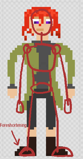
The hair is pretty well shaded! Try doing that to the rest of the body.
The hair is well shaded, but the anatomy is terrible.
I’d start with fixing the head shape, then move on to the rest of the body, think about perspective and where the light is coming from, where is the camera positioned? Will it fit the style of my game or story?
You might want to work on a different pose. It looks sort of bland, as is, like the character is lying down on an autopsy table. try to relax the shoulders. also, the legs are straight lines down, and that doesn’t looks right. wait, I’ll sketch smth.
Here’s a basic pose that I came up with. it looks a lot more dynamic even though the character isn’t doing anything. bend the knees a little, it does wonders. aside from that, maybe some extra shading might help, especially on the shirt under the overcoat.
It’s a good start! keep it up!
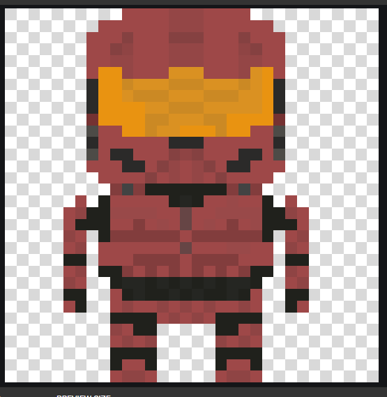
the shaded accents all around the armor look a bit too faded. for a low res sprite like this, you might want to make the details stand out more, or else you won’t notice it and it’ll just look like noise. otherwise it seems alright, if that’s the pose you want. if you want it to look slightly more realistic, you might want to change the pose a bit so that the shoulders aren’t sticking out that much, it makes it look unnatural and like a wooden doll
Another thingie. Main character for another game 
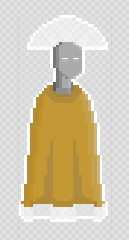
a very neat concept for a character! for the shading, you’d probably want to use it to convey the overall volume of the character instead of just doing rim lighting. it makes it look pretty flat. the shading you did for the folds in the robe are a good example. the volume and shape of the outfit is well conveyed with the shading, wheras the lighting on the very edge od the character doesn’t do this.
lemme know if this helps or if I need to explain it more clearly 
i am not new but i have made some art in my @Blackhole_1001 account wanna see it?
if you’d like to show me some, I’d gladly take a look!
Thanks. I’m glad you think it’s cool. I’ll make sure to improve the shading 
I didnt see this 0-0 i’ll screenshot it right away
Hey, any advice on the Till We Have Faces art?
I think I already talked about it on one of your threads, but I’ll give it another look, if you like
Yeah, sorry I think I was insane or something last time you told me lol. Sorry 
no worries, I wouldn’t be surprised if I was insane all of the time
I just made this too:
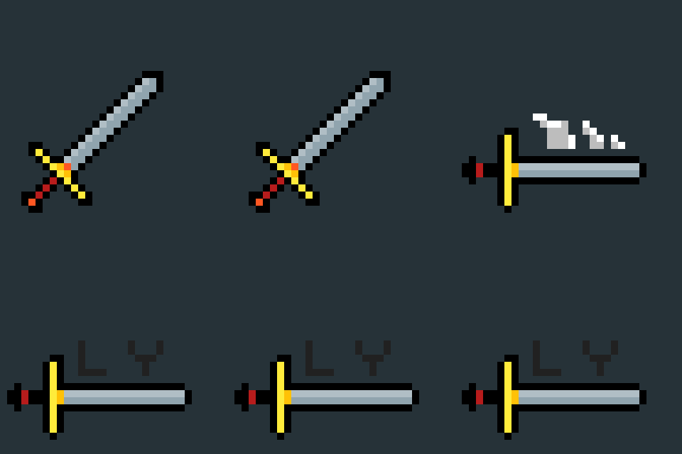
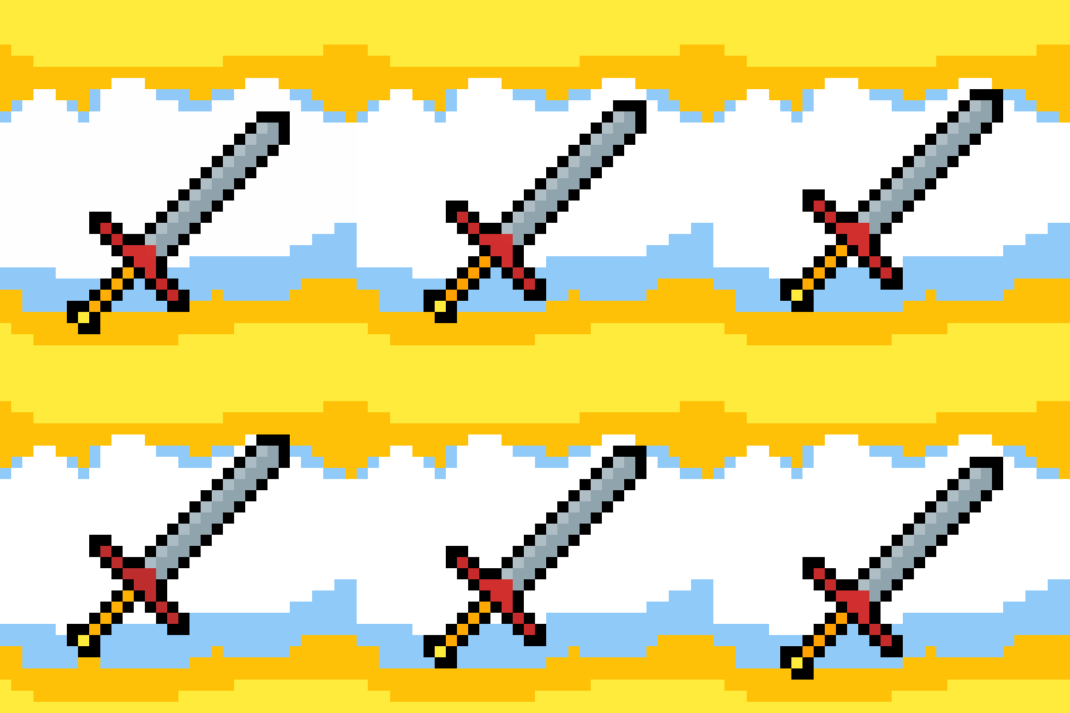
not terrible, very cool. however for the second one, is it just me or do the graphics get worse when the sword is horizontal?
Dude it’s so trash it’s actual garbage. Like, so bad that-
I’m obviously joking. Nice work 
