No problem, and great work on this sprite! The original and latest version are like night and day 
[EDIT]
Also, a 20x20 sprite should import just fine, and fit inside one block - just don’t try to scale it up when importing and it should look OK
No problem, and great work on this sprite! The original and latest version are like night and day
[EDIT]
Also, a 20x20 sprite should import just fine, and fit inside one block - just don’t try to scale it up when importing and it should look OK
Oh, thank you! I frequently look back at the original and I have absolutely no idea how I got to this point, but I’m definitely glad that it’s not like that anymore, lol.
Thank you, but when I try to do that it looks way too small, so I think I may just try to scale it up by hand.
Edit: scaling it up by hand is a lot harder than I thought it would be. I have no idea what I’m doing
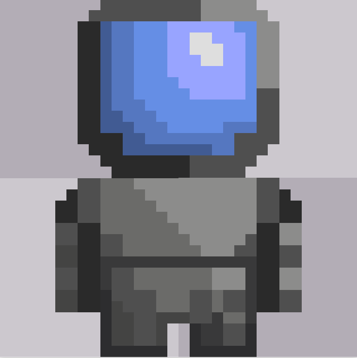
Try remaking it in 32x32 if you dislike 16x16.
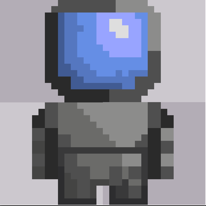
Ok, so I managed to manually make it into a 32x32 image. How does it look?
The helmet shading looks a bit weird, i’d say to remove those little bits sticking out or cover them up
I second that, when it comes to having smaller artwork I say less is usually more for easier visual comprehension.
Looking good though, I like the evolution this has gone through!
That looks awesome! Nice work 
Yay, thank you! Now I can animate it, lol.
Ok, but just a tip:
When animating with this style, you always want to turn the player sideways so it looks more natural.
Oh yeah, thanks for the tip. I just had a vivid image in my head of not turning the player and just having them crab-walk across the entire level, and it was hilarious
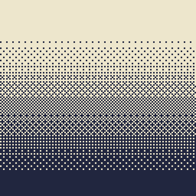
that’s… not dithering.
Dithering is when you use a pattern that creates an optical illusion of a gradient of colors.
Just a heads up, keep the size of each pixel the same, here you have a bunch of different sizes.
Also, what art program are you using? Most should have adoption to export at 200% to at least 400%.
I’ll be honest, I think the smaller sprite looked better. sometimes less is more, you know? it’s a lot easier to get jaggies (patterns of pixels that look awkward) when you size things up. You don’t have to listen to me, but it’s what I noticed looking at this newer sprite
//Gave a quick attempt here, with and without shading- to achieve a bit of a “crab-walk” some games will use the left and right animations (just flip the first drawn) as an all direction character because of the direction the character is facing; a sort of off center position.


EDIT: walking? + fixed legs.
//These have a bit of detail and one is very quickly shaded, but just for
inspiration on how to utilize a 16x16 sprite to the fullest.
I do still generally think yours is fine for what you need- I do however agree with Baron on this.
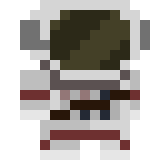
Oh, oops. I thought I knew what dithering was, lol. Also here, I made them all the same size (@Baron_Wasteland its back to 16x16) What do you guys think about this?
I suggest Piskel, fast free and convenient. Hard to beat and great at exporting.
And probably like 10 minutes or so, really easy size to knock out
Ok, so I started attempting to make an animation, and then I realized that I have absolutely no idea how to make a side view for my dude, so instead I went back to my original sprite and tried to just turn him slightly to the side, kinda like in @lonesable’s example. Here is what I ended up with:
I think the arm on the left is a bit too thick, but besides that it looks nice.
Yes, but that one pixel on the top of the left arm is a bit unnecessary and looks unnatural to me.